How DTC brands can avoid these 5 homepage conversion killers


Rebecca Anderson
How DTC brands can avoid these 5 homepage conversion killers
An online store’s conversion rate is one of the key metrics that DTC brands use to measure their success. Namely, is the consumer taking the desired action (like buying our product).
Nowadays, customers share a few expectations when it comes to shopping online:
They expect they can find what they are looking for with ease
They expect a seamless shopping experience from the first click to their final checkout
To accomplish this, you need to design store pages that are optimized for conversion.
Having a low conversion rate is painful for brands, as this directly impacts revenue goals.
Most brands suffer from one of five common mistakes that kill their conversion rate.
To help you increase your conversion rate, this article will explore how DTC brands have avoided these 5 common mistakes in their homepage design:
Conversion killer #1: Neglecting brand and product features on your homepage
The first mistake DTC brands make that can ruin their conversion rate is not giving enough attention to brand and product features on their homepage.
Research shows that one of the first things first-time DTC site visitors do is scroll through your entire homepage so they can get to know your brand AND your product offering.
In a nutshell, DTC site visitors want to:
Get to know your brand
Understand your product(s)
Visualize the core features of your product(s)
Compare you against your competition
See how their own values align with your brand
To improve your conversion rate - you’ll need to include the right mix of brand and product features.
Baymard Institute has advice to capture the intent of first-time site visitors:
→ For DTC sites with smaller offerings, they recommend that at least half of your product catalog is represented on your homepage.
Remember, if your store doesn’t show the full scope of what your brand has to offer, visitors are less likely to find what they are looking for.
How to incorporate brand & product elements onto your homepage:
Crafting the perfect homepage requires balance: you need enough information to satiate your consumer, but without it being an overwhelming information overload. Achieving this perfect balance will help tip the scale between a consumer continuing to explore your site or losing interest.
To create a homepage that shows off your brand and product features, use this checklist to audit the current state of your homepage.

Does your homepage showcase:
A representative sample of your product catalog
Descriptive product content (videos, images, illustrations, gifs, AR)
Strong branding elements and consistency (colors, shapes, fonts, feel)
Brand story and value proposition (include a small section on who you are and what you stand for (maybe even link to your about page))
Key product selling points (what are the main reasons to buy this product)
Unique product details (what makes your product stand out)
Transparency about policies (free shipping, returns, sustainability, etc)
Trust-factor elements (social proof or data that helps create trust in the brand/product)
To see what a homepage that converts looks like, let’s take a look at the homepage of a fast-growing DTC brand, Magic Spoon.
Remember - if Magic Spoon’s website is set up for conversion, then this quick audit will tell us who they are and what they sell.
Screenshot from the top of the Magic Spoon’s homepage:

Immediately at the top of their homepage, we can see some of these key elements in play:
We know what they are selling: cereal
Unique product details: high protein and grain-free cereal
Descriptive product content: a fun image that shows product options
Showcasing these elements helps a site viewer to get a sense of who Magic Spoon is and what they are selling (E.g., compared to other cereal options, Magic Spoon is a healthier alternative).
Scrolling down on their homepage, we find even more supporting content:
Screenshot from halfway through the Magic Spoon’s homepage:

This content block covers quite a few of the key selling points that can help convert users:
Showcasing your product selection: we can easily see all of the different flavors.
Trust-factor content: we see reviews from three trusted publications
Fun branding: the floating cereal pieces are animated and eye-catching
Beneath this section, we see more information about the product itself:

This content block covers quite a few of the key selling points that can help convert users:
Key USPs: we see three points here: the product is high-protein, keto-friendly, and sweet and delicious.
Brand story: Part of the “magic” of Magic Spoon is that the cereal is supposed to be an “adult” version of your childhood favorites - we see this message echoed in the description under “sweet & delicious”
Brand elements: the colorful spoon & bowl align with the magic brand feeling
As mentioned before, site viewers on DTC brand pages often want to see if a brand aligns with their values/tastes. Magic Spoon does a good job balancing their brand feel with product info.
Last but not least, near the bottom of the homepage, we get to learn a little bit more about who’s using the product and the brand story.
Screenshots from the bottom of Magic Spoon’s homepage:


This content section shows off their:
Key messaging: Namely - why did we grow up - but our cereal didn’t?
Customer-proof: the quotes from customers back up their brand messaging
Consistent branding: the colors of the cereal mimic well-known cereal brands
After making our way through the homepage - we clearly know who Magic Spoon is and what they offer.
All in all, auditing their homepage demonstrates the key branding and product elements that you don’t want to miss when focusing on creating a homepage that converts.
Conversion killer #2: Not spotlighting your bestsellers
Another way to help increase conversions is by guiding consumers to your top products. By highlighting your bestsellers or favorite products, a new visitor to your site can get a feel for your product offerings.
6% of sites aren’t showing a broad enough product range on their homepage.
If customers don’t understand what it is you sell, they are more likely to exit your site.
Adding a best seller’s category is a great way to showcase your product catalog AND guide customers to your best products.
→ This makes navigation easier for your customers.
→ And, gives customers recommendations (if other people are buying this, maybe I should too).
Let’s see what this looks like in practice.
Chewy is a popular online pet food and pet product retailer with a huge product catalog.
Screenshot from Chewy’s homepage:

Embedding their best-selling products on their homepage has a number of positive effects:
The diverse selection makes it easier to understand the scope of their offerings
The ratings underneath each product help visitors consider each product
The descriptive images and text already give a lot of info to shoppers
The new customer discount incentivizes customers to buy now
All of these points make it more likely that visitors will convert.
If you aren’t showing your customers the best of what you have to offer, you’re actively killing your conversion rate.
Conversion killer #3: Too many big, flashy ads
59% of eCom sites use overly distracting homepage ads.
Eye-catching ads may feel instinctively like an easy marketing tactic to catch a visitor's attention. However, overreliance on these tactics can create the wrong first impression for site visitors.
When advertising on your homepage, consider the following:
The size of the ad (larger = looks more spammy)
The placement (this is especially important when visiting your store on mobile devices)
The aesthetics (how does the ad fit with the design of your page)
First, let’s see what not to do:
Let’s go back to our Chewy example.
Screenshots from Chewy’s homepage:

The top of their page includes a carousel with a very aggressive ad feel.
The focus is on the discounts and offers - instead of providing information on the types of products offered or the brand.
The banner above the carousel stacks an offer on top of another offer.
Prime product content real-estate on their homepage is dedicated to their deals - which distracts visitors from being able to scan and review the products offered versus their needs/wants/desires.
Now, let’s see what a well-integrated, not flashy ad looks like in practice.
Stitch Fix, a personal styling site that offers personalized clothing items, masters the balance of displaying an ad without overwhelming or overpowering the organic content on the site.
Screenshot from Stitch Fix’s homepage:

The ad in the banner offers a $20 credit, with the majority of the viewport displaying product categories.
With the sale in the banner, it doesn’t distract from the other product and brand content that should be the primary content on the homepage, so that visitors can asses your brand and product offering.
The focus is instead on their message, making it clear that they offered personalized clothing services.
The Decathlon also offers an example of a more overt ad on their homepage:

Although this sale ad is more prominently displayed - the fact that there is only one ad makes it less overwhelming than sites where there are multiple competing ads. This makes it easier to find the sale as well - increasing the likelihood of conversions on that one CTA versus another.
Remember - when designing your homepage - be careful with how many ads you include and their placement; otherwise, you risk delivering the wrong first impression to visitors.
Conversion killer #4: Poor use of carousels
Carousel slides on your homepage may seem like an engaging and beautiful way to display your product, without adding clutter.
But, only 41% of sites with homepage carousel ads have implemented them correctly.
By correctly, we mean without any usability issues. Usability issues can hinder the shopping experience and make it more difficult for visitors to find their way to your products.
Where does carousel implementation go wrong?
Timing: Images can pass by too fast, which can be distracting or cause viewers to miss the content entirely. Creating a carousel with click-through features is one option to consider.
Content Sequence: Ensure that the first slides are the most important ones for visitors who quickly scroll away.
Look and feel: As mentioned in the last chapter, some carousels can feel too much like a spammy ad.
Mobile performance: on desktop - it’s easier to infer from a visitor’s mouse hover that they are reading the carousel - on mobile - getting the timing right for an autorotating carousel is really tricky without this cue.
Keeping these elements in mind can ensure that your carousel implementation on your homepage does not detract from the site visitor experience.
Bonus tip: a good alternative to having a carousel is using a high-quality, static hero image!
Let’s see an example of a well-executed carousel:
Kylie Cosmetics uses two different tactics for desktop and mobile:
On desktop:


The images above rotate based on time and mouse hover on the carousel.
Users can click and drag to manually go through the carousel - but adding a visual cue like an arrow or three dots on the bottom of the carousel might help make this possibility more clear.
Remember - It’s important to consider what the first image will be as this is the image that will be the most visible for those quickly skimming through the homepage.
On mobile:

On mobile, it is easy to swipe through each image in the carousel.
There is a visual cue with the three dots below the “shop now” CTA button.
Remember - consider carefully if you need a carousel, how to make your carousel accessible on mobile and desktop, and what content to include to create the best user-friendly experience on your homepage.
If you can’t achieve these best-practice tips, in many cases, a well-designed static image might be a better option.
Conversion killer #5: Lack of custom imagery
1 in 5 brands isn’t using custom imagery on their homepage.
By custom imagery, we mean the images that are created specifically for a brand’s homepage that showcase a brand’s product and feel.
Using custom imagery alongside a well-designed page is essential for creating a lasting-first impression on site visitors.
Repeat testing has shown that sites with inspiring, custom-made imagery outperformed sites with bland, stock photography.
When creating images for your site, keep the following aspects in mind:
Are the products displayed within their use-context?
Is our brand-feel conveyed in our imagery?
Does the imagery stand out visually?
Are the images engaging/exciting?
Let’s check out examples of two online homeware stores to see what to do, and what not to do:
Screenshot from Emma Bridgewater’s Homepage:

In the hero image - it is clear there is a sale - but this message overpowers everything else. While it is certainly not bland - as a first-time site visitor, one has no idea what this shop sells.
Screenshot from scrolling down a bit:

Scrolling past the hero image, we still have only one image of a product - and it is the free product that is given after a visitor has spent a certain amount. While this discount may help with conversions, this page misses out on the opportunity to showcase any products.
Screenshot from Cult Furniture’s Homepage:

Here we see a bold hero image that showcases both a few products and the brand feel with the funky colors and design. Both this example and the previous one emphasize a sale - but this example gives a lot more visual cues about the products.
Another screenshot after scrolling down a bit:
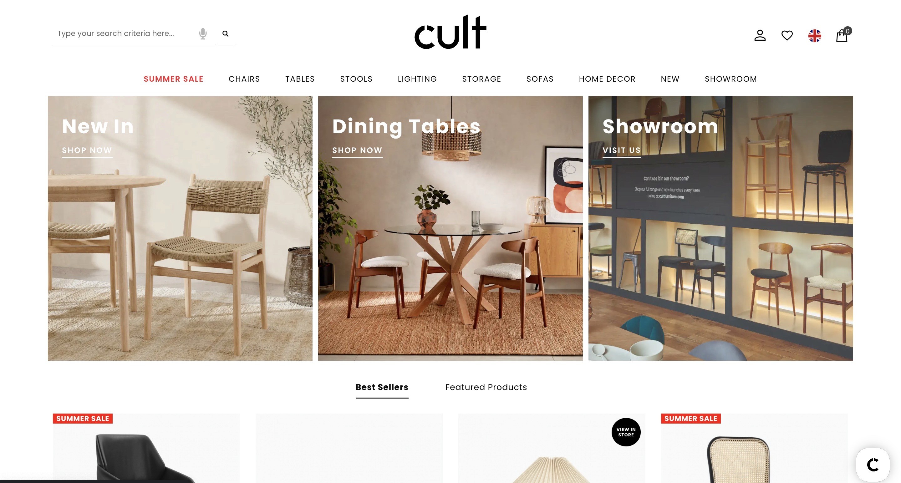
Under the hero image, there are three photos that showcase their main products (tables and chairs) in professional, attractive photography.
Perhaps a critique of this homepage is that there is only one photo on their homepage with someone actually sitting on a chair (i.e. using their product). Adding a few photos with active use cases of the product could help create even more engaging imagery.
Remember - creating custom imagery is key to creating a great first impression around your brand and your product offerings. Go for brilliant images - not bland ones.
How to improve the conversion rate of your eCommerce homepage
Traditional eCommerce DTC sites tend to make 5 common mistakes that kill their homepage conversion rate.
Because your homepage is where many visitors will make their first impression - getting it right is paramount.
Otherwise, visitors will exit before they even consider adding something to their cart.
Remember to craft your page to showcase your brand and your product offering.
To fix these common conversion killers, take the following steps.
Shine a light on your brand & product features
Promote your best sellers
Avoid going overboard with ads
Consider the best use of carousels
Create custom, inspiring imagery
One way to make sure you’re online store is conversion-ready is by using the best tools.
If you’re curious about what tools out there can help you create conversion-ready pages - read our bonus chapter on all-visual, no-code page building.
If not, don’t forget to use these tips to increase the conversion rate of your eCom store!
If you’re excited to try building pages for your eCom store on Instant, join our waitlist to try out the Instant Beta.
Weekly Shopify tips from our founder in your inbox. Read in 3-mins or less. Start converting like an eCommerce expert.
More stories

Instant News
·
Apr 24, 2024

Shopify
·
Apr 24, 2024

CRO
·
Apr 24, 2024

